The Speed Map product visualizes travel speeds for a route in a given direction. This can be used to identify where planning efforts should be focused on by identifying:
- routes with slow travel times which can lead to a poor rider experience
- routes with highly variable travel times which can lead to an unreliable rider experience
- and stops with high dwell times which might be candidates for additional infrastructure investment
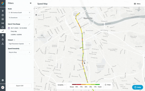
Filters
The Speed Map product includes a number of filters for focusing in on a specific route’s speed data.
Date & Time Range
You can look at performance for a single day or over a longer date range, as well as exclude any particular days/dates that may impact on-time performance (snow days, Sundays, events that disrupt service, etc.).
Dataset
Speed Map offers two datasets. Speed values between the datasets will not always line up because they come from different sources and are useful in different cases.
High-resolution is the recommended dataset for most cases. It provides the most accurate, detailed speed metrics.
Low-resolution is good for quick high-level picture and visualizing dwell. This dataset uses an algorithm to differentiate between time spent traveling and at a stop. This is then used to calculate speed and dwell. The benefit of this is seeing dwell data, the downside is the speed values are less precise. (This dataset was previously called "stop-to-stop in an earlier version of Speed Map)
Speed Granularity
High-resolution data can be viewed in ~25m increments or between stops. The low-resolution data can only be viewed at the stop-to-stop granularity.
Map Visualizations
Selecting a metric
By default the map shows the 50% (median) speeds for a given segment. The map can be viewed by additional metrics by toggling the metric filter in the legend. The metric options includes:
- Slowest (10th percentile) - this gives a sense for how bad speeds are at their worst. 10% of the time riders will experience speeds this poor
- Median (50th percentile)
- Average
- Free-flow (85th percentile): 85th percentile is often used as a metric for approximating the free-flow (operating) travel speed. This answers "how fast could buses go down this street"
- Fastest (90th percentile)
- Variability - Median compared to free-flow (median/85th percentile): While there are many ways to visualize variability, comparing 50th and 85th percentiles allows you to answer “How much slower than it’s free flow speed does the bus typically move”. This is helpful for understanding reliability and how much speeds vary.
Map legend
Selecting the pencil icon in the legend will allow you to edit the "buckets" that are color-coded on the Speed Map.
How to read the map
Identify slow/highly variable segments – The slower/more variable the segment, the more red the segment line will be. Check the Legend at the bottom of the screen for reference. Click on any segment to reveal more detailed information about speed and the number of captured trips. Use "slowest speeds" for understanding how bad speeds might be at their worst. This metric answers "how slowly might a rider experience this segment?"

Data
Downloading Data
Basic speed data can be exported from the dashboard by clicking the “Export CSV button”.
Expanded Speed Map Data
Using the Speed Map API, under API Guide > Speed Map. Users can export Speed Map data in geojson or CSV format by changing the query parameter ‘format’.
GeoJSON format can be imported to GIS environments, such as ArcGIS, QGIS, etc., without the need for any coding.
Route shapes
You can pull high-resolution route-direction shapes for all routes at once using the Agency Routes endpoint with verbose=true.
Use this request:GET https://api.goswift.ly/info/{agencyKey}/routes?verbose=true
That returns a list of all routes, and for each route it includes the route shape info (so you can grab shapes for every route and direction in one call).
One note: the high-resolution Speed Map API only returns shapes where we have AVL match data, so some route parts may be missing if there were no AVL reports in the time window.
For more on API access, see: https://swiftly.zendesk.com/hc/en-us/articles/38801001105165-API-Access.
Speed Estimation Methodology
High-resolution speeds are derived directly from the vehicle location data and where along the route path the vehicle is. Sequential observations and the implied speed based on the distance between vehicle location observations and the gap in time are then used to estimate speeds that fall within segments of up to 25 meters. Actual segments may be shorter when the distances between stops do not cleanly break into 25-meter segments. Instead, we will provide information in equally-sized segments. Time spent slowing down towards, dwelling at, and speeding up from a stop is incorporated into the segments closest to stops, so you'll notice slower speeds around stops.Low-resolution speeds are calculated using stop-level estimates of when a vehicle arrived and departed a stop. The time spent traveling from one stop to the next is determined by using the estimated departure time from the prior stop and the estimated arrival time to the subsequent stop. This information is based on vehicle location data and does not include time spent at a stop ("dwell"). To calculate speed, which is distance divided by time, the distance is specified in GTFS and is divided by the observed travel times.
Data quality
The accuracy of Swiftly's speeds is a function of the underlying data. When vehicle location data is infrequent, speed data, particularly for shorter segments, may be less accurate as a vehicle can traverse multiple stops between GPS pings. Additionally, speeds data may be inaccurate if the location of the stop in the GTFS shape is not where the vehicle actually stops or if there is an active detour.
What data is included in Speed Map?
In order to provide the most accurate speed data, Speed Map filters out the following segment observations with:
- 40meters/second (80MPH) speeds (128 km/h)
- path shapes that differ from the scheduled geometry (ie detours)
Additionally speeds data is not available when there is an insufficient sample size (<5 observations). Consider increasing your date & time range to increase sample size.
In the exportnumObservedTrips shows the number of observed traversals of this stop path that have met Swiftly’s data quality criteria. numCapturedTripsshows the number of observed traversals of this stop path.
Why am I seeing missing data in Speed Map?
A segment will show up empty in cases where there are no speed observations for the specified filters. Stop locations will still render for context.
If there is an insufficient sample size, Swiftly will show a grey route shape. You can try expanding the date and time range of your search to see data for given segments.
Take Speed Map Beyond the Basics
Swiftly Customer use cases:
- VTA Liberates Its Data from the Stone Age with Swiftly
- Speeding Up Transit and Project Timelines at Santa Clara VTA
- Swiftly’s Speed Map Goes Hi-Res
Customer Community Training Webinars:
Comments
Article is closed for comments.